KS4 Grade 10 - STATISTICS
Lesson 5...CUMULATIVE FREQUENCY
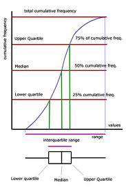
CUMULATIVE FREQUENCY (C.F.) is the total frequency up to a given point in a set of data
By plotting a C.F. curve (see image on left), a number of observations can be made for Lower Quartile (25th percentile), Median and Upper Quartile (75th percentile) values.
This then allows the calculation of the Inter-Quartile Range (IQR) where
IQR = upper quartile - lower quartile
TASK 1 - Textbook Pg347 Ex7
HOMEWORK - Finish TASK 1
Lesson 4...SCATTER GRAPHS, CORRELATION, LINES OF BEST FIT

To discover if there is a relationship between two sets of data, plot the data on a SCATTER GRAPH.
Scatter graphs then help to see any CORRELATION between the two variables (see image on left). This correlation can be described as positive or negative, strong or weak. However, sometimes there is no correlation between sets of data.
If correlation is present, a LINE OF BEST FIT can then be drawn with equal number of points on either side of the line. This line can then be used to make reasonable estimates about data not included in the original set.
TASK 1 - Textbook Pg144 Ex6
HOMEWORK - None set
Lesson 3...AVERAGES

The MEAN is found by adding all the numbers together and then dividing by the number of values in the set
The MEDIAN is found by writing the numbers in ascending order and then finding the middle value
The MODE is the value which occurs the most in a data set
The RANGE is a value showing the spread of the date and is found by subtracting the smallest value from the largest
TASK 1 - Textbook Pg332 Ex3 Q5, 7
TASK 2 - Textbook Pg336 Ex4 Prime Qs
HOMEWORK - Read Textbook Pg339 'Data in groups'. Attempt Pg339 Ex5
Lesson 2...FREQUENCY POLYGONS & HISTOGRAMS

FREQUENCY POLYGONS can be drawn by joining the mid-points of the tops of the bars of a frequency chart
In a HISTOGRAM the frequency of the data is shown by the area of each bar. Bars can vary in width and therefore the height of the bar represents the 'frequency density' found by:
frequency density = frequency/class-width
TASK 1 - Textbook Pg330 Ex2 All Qs
TASK 2 - Textbook Pg332 Ex3 Q1-3
HOMEWORK - None set
Lesson 1...INTRO TO STATISTICS

IGCSE Statistics knowledge:
AVERAGES - Mean, Median, Mode, Range
TABLES - Tallying, How to construct, How to interpret, How to draw diagrams from tables
DIAGRAMS - Bar charts, Pie charts, Pictograms, Frequency distribution, Histograms, Cumulative
frequency, Scatter graphs (correlation)
TASK 1 - Textbook Pg327 Ex1 All Qs
HOMEWORK - None set
| chap_10_igcse.pptx |
